
The article translated into Japanese (https://current.ndl.go.jp/ca2031)
Current Awareness
No.354 December 20, 2022
CA2031
The Data Visualization Roadshow: A data visualization session provided by an academic library
Background
The demand for technical and design skills necessary to effectively tell stories from data using visual media is increasing across disciplines and industry(1). These data visualization skills are important as the amount of available data grows and misinformation becomes more prevalent(2). Researchers are both consumers and producers of data visualization, so it is critical for them to understand how to both interpret graphical representations of data and effectively use them to communicate ideas without misleading audiences. Support for data visualization, which aligns well with the long-standing mission of academic libraries to support information literacy, has enjoyed relatively rapid growth in recent years: Cox et al. (2017) reported 18-22% of academic libraries providing data visualization support in 2016(3), while five years later, a survey by Zakaria (2021) indicated 60% of academic libraries were supporting data visualization through workshops and online tutorials(4). Service units, such as libraries, are well-equipped to serve broad audiences, countering the “siloing” effect, whereby data visualization skills are “locked up” in specialized academic departments(5).
Multiple models for supporting data visualization through academic libraries exist; these models are often designed to intentionally counter common challenges in data visualization support.
Such challenges include unfamiliarity with data sets, inaccessibility of advanced concepts by novices to data visualization, and an absence of data visualization opportunities in early undergraduate education. The New York University Health Sciences Library created a “Data Visualization Clinic”, where researchers received peer feedback on visualizations to be used in presentations and publications(6). This approach afforded an opportunity for researchers to work with their own data, which reduces cognitive load of working with an unfamiliar data set. Another model, designed to support data visualization at an introductory level, used the common software Microsoft ExcelⓇ to introduce data visualization concepts (7). The hands-on approach of this model avoids the traditional theoretical data visualization introduction and instead empowers entry-level learners to continue developing data visualization skills. Finally, academic libraries could support data visualization skills development through integration in early undergraduate education, to prepare students for data intensive careers(8). These models highlight opportunities and challenges common in supporting data visualization skills development.
At the authors’ institution, the University of Arizona, support for data visualization recently underwent a shift from reactive to proactive support. Historically, this support had largely been provided in an ad hoc manner, through a pair of service units(9). Both service units employ personnel with applied experience in data visualization and analysis to support campus researchers: D. Bayly in the Research and Discovery Technologies department of University Information Technology Services, which supports research through centrally-funded services and infrastructure. J. Oliver is in the Data Cooperative, the unit within the University Libraries that supports data-intensive research through training and consults. Members of the Data Cooperative work with graduate students, post-docs, and faculty to develop skills and identify computational resources for effective data analysis, management, and visualization.
As requests for workshops increased, we decided to identify a suite of specific data visualization skills we could teach in a brief (one hour) workshop format, while addressing common challenges faced in data visualization support. The skills we focused on were understanding how data visualization can convey information better than written communication and using software to develop effective data visualization. We also designed the content and delivery of the workshops to avoid extraneous cognitive load caused by using data that learners are not familiar with (i.e. using a biological data set in a workshop for civil engineers) and the use of overly complex software that novice learners would find difficult to navigate outside of the workshop environment.
Service in practice
Our approach, called the Data Visualization Roadshow, covers a set of introductory data visualization ideas, tools, and campus specific resources and events. We go to certain lengths in order to “meet the audience where they are”, both in terms of the audience members’ knowledge and by presenting where the audience regularly meets. We debrief sessions within a week and apply easy changes. After several sessions we identify the recurring critiques that require large-scale changes. We document and address these before scheduling future sessions the following semester. The following paragraphs are a general overview of what the sessions include as well as our scheduling and evaluation practices.
We schedule our sessions in coordination with participants. Our most successful route for arranging sessions relies on direct emails with teaching faculty who are in charge of a student course. Another route is to contact individuals organizing skill-share events. We have also found coordinating with college-specific program coordinators and liaison librarians to be successful.
Our session followed a general formula with sections that varied with respect to the audience we had. All instances of the Data Visualization Roadshow included:
- Discussion of why we visualize data
- How to use data visualization to tell a story
- Common resources for visualization
- Hands-on exercise for data visualization with a programming language (R(10), Python(11))
- Hands-on exercise for data visualization with graphical tools (Voyager(12), RAWGraphs(13))
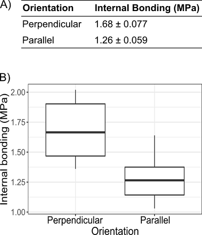
When discussing the need for data visualization, we found it useful to compare examples of text-only data representations to a graphical representation of the same information. In an early session for a Civil engineering graduate seminar we presented a table and a graph of the orientation of fibers in plywood and corresponding internal bonding strength (Figure 1)(14). We asked our audience if the strength of the plywood, as measured by internal bonding, is stronger when the fibers are in a perpendicular orientation or when they are in a parallel orientation. The audience commonly responded “maybe” or hesitant “yes” when looking at the text-only representation (Figure 1A), and responded with a confident “yes” when looking at the boxplot representation (Figure 1B).
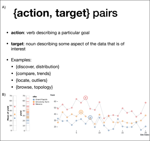
The session later featured Tamara Munzner’s “Action, Target Pairs” (15) presenting categories of common actions performed by someone looking at a visualization, and aspects of the original data that are targets of these actions (Figure 2). The “pair” is a pair of words, one verb and one noun, that describe the intention of the visualization. For example, if the goal of a visualization is to identify data points that might lie outside the expected distribution, the action target pair would be “identify, outliers.” In this example the “action” is identification and the “targets” are outlier points.
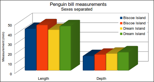
After this introductory lecture on the rationale of data visualization, we switched to interactive and hands-on activities. This involved a critique of a three-dimensional bar chart (Figure 3) where we asked participants to identify potential problems with the chart (what does the third dimension add? why are groups represented twice?).
Later, we collaborated with a fellow UA Libraries staff member with expertise in geospatial data visualization and she provided a “match the map to the story” exercise (Figure 4).
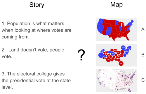
These activities stressed two things: having someone else evaluate whether the primary message of visualization is communicated effectively and a single dataset can tell different stories depending on visualization choices.
All iterations of the workshop included the audience activity to “Sketch a data visualization”. In this activity, we presented a small dataset with five to eight rows of data then asked participants to draw, by hand, a graphic representation of the data. We left the type of graph intentionally ambiguous to encourage our audiences to get creative with their visualizations. This part of the session changed to reflect each audience. For example, our session to the graduate colloquium of Environmental Sciences featured soil biochemistry data (Kirsten Ball, unpublished data); our session to a Math graduate summer training group featured the SIR (susceptible, infected, recovered) infection model(17) and vaccines administered vs COVID-19 cases per 100,000 individuals; in our inaugural session to Civil Engineering students, we provided a table representing the positive relationship between cement concentration and compressive strength(18). This activity emphasized the importance of rapid prototyping for visualization development, rather than spending excessive amounts of time on a visualization that is ultimately unsuited for the intended message.
At this point in the session, we transition to “hands-on” experiences with visualization tools. We made use of our audience-specific dataset and Jupyter Notebookshosted by Binder(19)to guide the audience through simple exercises to generate plots with either the R or Python programming languages. Jupyter Notebooks provide an accessible development environment for writing and testing code in languages such as R and Python. When time and interest permitted, we also included an example using Observable notebooks (20). Audiences always enjoyed the barchart race(21) which demonstrates the power of animations for visualizing time series data. We also feature non-programmatic web visualization tools like Voyager and RawGraphs. These tools are especially useful when leveraged early in the visualization process, allowing the user to think visually while exploring data.
We close the Data Visualization Roadshow by highlighting available resources. We enumerate our departmental services and repeat our contact information. We share information about upcoming visualization events such as the UA library’s annual data visualization contest or the local viewing of the preeminent international visualization conference, IEEE Vis (22). We point out our Slack workspace that audiences can join to get support as they apply their knowledge to their own work. Lastly, we request attendees to fill out a feedback form with one thing we did well and one thing we could improve to help us evaluate the session.
Evaluation
We have been intentional in improving the content and delivery of the session. For scheduling sessions, we found that working within an existing class or event structure gave us important benefits: we did not have to recruit an audience when we coordinated with a seminar or event host; having a concrete audience available prior to the session made it easier to identify relevant example datasets. When we deviated from this model, and arranged separate, stand-alone sessions, we had lower turnout and had to rely on generic datasets retrieved from online sources.
When possible, we reflected on each delivery of the Data Visualization Roadshow the week after presenting. One example outcome was our decision to make all visualizations in the sessions simple enough for an audience member to feel they could have made it while effectively conveying information. This resulted in a more sustainable development model for us as well. We arrived at this decision after implementing a complex visualization of simulated traffic through an intersection for an audience of civil engineering students. The students appreciated the intricacy, but had difficulty interpreting the information the animation attempted to convey.
Our section on best practices in data visualization also required revision. Originally we shared several ideas from Edward Tufte on developing efficient and unbiased visualizations(23). It became clear that these best practices, such as minimal use of unnecessary aesthetics, are implemented by default in common data visualization software. We replaced the section with Tamara Munzner’s “Action, Target Pairs”, which provides a relevant, conceptual framework for data visualization that applies with or without data visualization software. Through changes like this over the course of 10 separate sessions, we arrived at a format and a routine that balances flexibility and reusability to provide data visualization introductions across campus.
Implementation
The session we describe here is reuseable at other academic institutions, provided key resources are available. First, the presenters should have an understanding of the data visualization landscape in terms of best practices and available software. The authors, who are both in research-facing support positions, were able to draw on their own experience with data visualization in the development and delivery of the session and addressing questions from the audience that arise during the session. The session can be delivered in-person or in an online environment; participants need only a web-enabled computer with a modern web browser to participate in the hands-on activities. The time required for preparation for the session will depend on the level of customization required; if using commonly available datasets, such as the 1974 Motor Trends road test fuel consumption dataset(24) or measurements from three species of penguins(25), there is little to no effort required to update materials from one session to the next. If the examples are to be drawn from the domain of expertise of the anticipated audience, customization, which can include identification of appropriate data sets, modification of code to suit the dataset, and revision of the slides, can take between two and four hours of preparation time. The session itself is designed to span one hour, with time for questions and troubleshooting. An example session is available at Google Slides(26) and a list of Jupyter Notebooks used in the session are available at GitHub(27). All materials are licensed with permissive licenses for ease of modification and re-use.
Research and Discovery Technologies, University Information Technology Services, University of Arizona: Devin R. Bayly
Research Engagement, University Libraries, University of Arizona:Jeffrey C. Oliver
(1)National Academies of Sciences, Engineering, and Medicine. Data Science for Undergraduates: Opportunities and Options. National Academies Press, 2018, 138p.
https://doi.org/10.17226/25104, (accessed 2022-09-16).
(2) Aghassibake, Negeen et al. Supporting Data Visualization Services in Academic Libraries. The Journal of Interactive Technology and Pedagogy. 2020, 18.
https://jitp.commons.gc.cuny.edu/supporting-data-visualization-services-in-academic-libraries/, (accessed 2022-09-16).
(3) Cox, Andrew M. et al. Developments in Research Data Management in Academic Libraries: Towards an Understanding of Research Data Service Maturity. Journal of the Association for Information Science and Technology. 2017, vol. 68, no. 9, p. 2182–2200.
https://doi.org/10.1002/asi.23781, (accessed 2022-09-16).
(4) Zakaria, Mahmoud Sherif. Data Visualization as a Research Support Service in Academic Libraries: An Investigation of World-Class Universities. The Journal of Academic Librarianship. 2021, vol. 47, no. 5, 102397.
https://doi.org/10.1016/j.acalib.2021.102397, (accessed 2022-09-16).
(5) Aghassibake, Negeen et al. op. cit.
(6) LaPolla, Fred Willie Zametkin; Rubin, Denis. The “Data Visualization Clinic”: A Library-Led Critique Workshop for Data Visualization. Journal of the Medical Library Association. 2018, vol. 106, no. 4, p. 477-482.
https://doi.org/10.5195/jmla.2018.333, (accessed 2022-09-16).
(7) LaPolla, Fred Willie Zametkin. Excel for Data Visualization in Academic Health Sciences Libraries: A Qualitative Case Study. Journal of the Medical Library Association. 2020, vol. 108, no. 1, p. 67-75.
https://doi.org/10.5195/jmla.2020.749, (accessed 2022-09-16).
(8) Shao, Gang et al. Exploring Potential Roles of Academic Libraries in Undergraduate Data Science Education Curriculum Development. The Journal of Academic Librarianship. 2021, vol. 47, no. 2, 102320.
https://doi.org/10.1016/j.acalib.2021.102320, (accessed 2022-09-16).
(9)Oliver, Jeffrey C. et al. Data Science Support at the Academic Library. Journal of Library Administration. 2019, vol. 59, no. 3, p. 241–257.
https://doi.org/10.1080/01930826.2019.1583015, (accessed 2022-09-16).
(10)The R Project for Statistical Computing.
https://www.r-project.org, (accessed 2022-09-16).
(11)“Python Language Reference”. Python.
https://docs.python.org/3/reference/, (accessed 2022-09-16).
(12)Voyager.
http://vega.github.io/voyager/, (accessed 2022-09-16).
Wongsuphasawat, Kanit et al. Voyager: Exploratory Analysis via Faceted Browsing of Visualization Recommendations. IEEE Transactions on Visualization and Computer Graphics. 2016, vol. 22, no. 1, p. 649–658.
https://doi.org/10.1109/TVCG.2015.2467191, (accessed 2022-09-16).
(13)RawGraphs.
https://www.rawgraphs.io, (accessed 2022-09-16).
(14)Auriga, Radosław et al. “Data for: Performance Properties of Plywood Composites Reinforced with Carbon Fibers”. Mendeley Data. 2020-06-07.
https://doi.org/10.17632/HKGSTM9SXG.1, (accessed 2022-09-16).
(15)Munzner, Tamara. Visualization Analysis & Design. 1st edition, CRC Press, 2015.
(16)Field, Kenneth. Thematic Maps of the 2016 Presidential Election (lower 48 states).
https://carto.maps.arcgis.com/apps/MinimalGallery/index.html?appid=b3d1fe0e8814480993ff5ad8d0c62c32, (accessed 2022-09-16).
(17)Kermack, W. O.; McKendrick, A. G. Contributions to the Mathematical Theory of Epidemics—I. Bulletin of Mathematical Biology. 1991, vol. 53, no. 1–2, p. 33–55.
https://doi.org/10.1007/BF02464423, (accessed 2022-09-16).
(18)Yeh, I. C. Modeling of Strength of High-Performance Concrete Using Artificial Neural Networks. Cement and Concrete Research. 1998, vol. 28, no. 12, p. 1797–1808.
https://doi.org/10.1016/S0008-8846(98)00165-3, (accessed 2022-09-16).
(19)Project Jupyter et al. “Binder 2.0 – Reproducible, Interactive, Sharable Environments for Science at Scale”. Proceedings of the 17th Python in Science Conference (SciPy 2018). 2018, p. 113–120.
https://doi.org/10.25080/Majora-4af1f417-011, (accessed 2022-09-16).
Jupyter.
https://jupyter.org/, (accessed 2022-09-16).
Pérez, Fernando; Granger, Brian E. IPython: A System for Interactive Scientific Computing. Computing in Science & Engineering. 2007, vol. 9, no. 3, p. 21–29
https://doi.org/10.1109/MCSE.2007.53, (accessed 2022-09-16).
(20)Observable.
https://observablehq.com/, (accessed 2022-09-16).
Bostock, Michael et al. D3: Data-Driven Documents. IEEE Transactions on Visualization and Computer Graphics. 2011, vol. 17, no. 12, p. 2301–2309.
https://doi.org/10.1109/TVCG.2011.185, (accessed 2022-09-16).
(21)“Bar Chart Race, Explained”. Observable.
https://observablehq.com/@d3/bar-chart-race-explained, (accessed 2022-09-16).
(22)VIS 2021 Satellite Sites.
http://ieeevis.org/year/2021/info/satellite, (accessed 2022-09-16).
(23)Tufte, Edward R. The Visual Display of Quantitative Information. 2nd ed, Graphics Press, 2001.
(24)Henderson, Harold V.; Velleman, Paul F. Building Multiple Regression Models Interactively. Biometrics. 1981, vol. 37, no. 2, p. 391-411.
https://doi.org/10.2307/2530428, (accessed 2022-09-16).
(25)Horst, Allison M. et al. “Allisonhorst/Palmerpenguins: V0.1.0”. Zenodo, 2020.
https://doi.org/10.5281/ZENODO.3960218, (accessed 2022-09-16).
(26) Oliver, Jeff; Carini, Kiri; Bayly, Devin. Data Visualization.
https://docs.google.com/presentation/d/1g13QTzIWMIa3OkOzTEJ-LP3GD7iZL-9xgu-geq05bOg/edit?usp=sharing, (accessed 2022-09-16).
(27)“jcoliver/data-viz-roadshow”. GitHub.
https://github.com/jcoliver/data-viz-roadshow, (accessed 2022-09-16).
![]()
This article(CA2031e) is licensed under a Creative Commons Attribution 4.0 International License. The full license details are here https://creativecommons.org/licenses/by/4.0/deed.en.